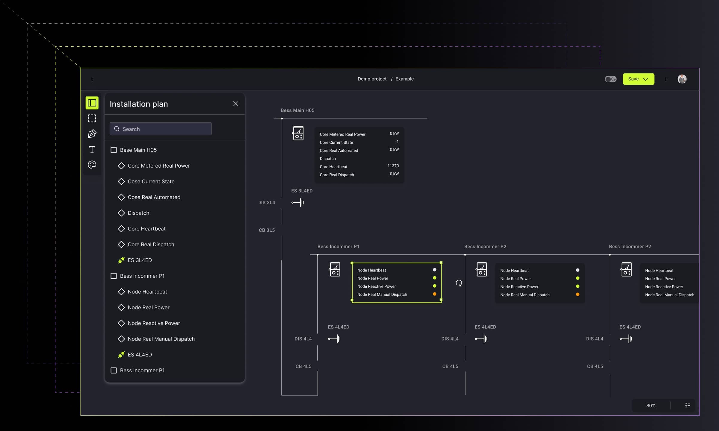
Choosing the proper layout for multi-level graph visualizations
Learn how a custom layout solved the limitations of automatic graph layouts, improving clarity, reducing link overlap, and speeding up development.

Data visualization is an essential aspect of data analysis. As the complexity of data increases, it becomes more challenging to represent it meaningfully. Graphs and diagrams are powerful tools that can help visualize complex data structures, but designing the appropriate layout is key to making them legible. This blog post will discuss the challenges of choosing the right layout for a multi-level graph visualization and how we solved this problem for a client.
The limitations of automatic layouts for multi-level graph visualizations
Automatic layout algorithms have emerged to tackle the challenge of effectively displaying and interpreting complex data structures. Their ability to automatically position graph nodes and edges in appealing ways makes them extremely useful, but they can't be considered a silver bullet due to their limitations.
The decision to choose the specific layout can't be random. It has to fit into the specific data set. When it is not, automatic layout algorithms may struggle with representing the graph hierarchy, resulting in distorted or ambiguous visual representations and a lack of scalability. The more suitable the layout is for specific data, the less time takes its customization, and the time-to-market is cut.
Challenge
While working on a real-life project, one of our clients presented us with a graph containing multiple levels, groups, ports (one of several points inside a node to which a link can be potentially attached), and links. The nodes in the chart had ports, and some were nested inside groups, making the whole data structure very complex.


Automatic layout, chosen by client, wasn't able to cover both positioning inside groups and between groups at once. In fact, it worked as two separate layouts: inside and outside groups, which resulted in problems with readability. The links were crossed and overlapped, making it difficult to understand the relations between elements.
The client wanted to use an automatic layout to position the nodes and links to make the graph readable. However, the ones used by the client did not provide desired readability. After researching, we discovered why: all the automatic layouts have been working on just one level - either on top-level groups or inside individual groups. Additionally, the client's automatic arrangements did not consider that nodes could be in subgroups and contain many ports.
Designing a layout to address multiple levels and ports in graph visualizations
The customized layout was a natural way to solve the problem, as the client was looking for an advanced layout able to cover all complex and nested data structures at once, and position all nestings simultaneously.
Solution
We reached out for one of the state-of-art layouts we found the most suitable for the client's needs (it simultaneously addresses the main level, the inside of the groups, and many ports on the node). Then, we connected it with the client's database and integrated it with the visualization library, making it tailor-made for the client's requirements.


Layout, chosen by Synergy Codes, was more suitable to the client's data set. It was able to optimize the links between elements as it "saw" both the relations within groups and the relations between groups and could reserve the optimal amount of space for displaying the links, minimizing their crossing and overlapping.
The development process was cut to the minimum, as we had a comprehensive library of reusable components - Vislabs.ai - with a ready-to-use integration of layouts with the GoJS library. With these predefined, reusable components and our expertise in harnessing them, the time-to-market of this project was counted in days.
Overcoming data model challenges to implement a multi-level graph layout
While implementing the layout, it turned out that the client’s data model did not collaborate well with the automatic design and demanded some tweaks. This is because the automatic layout works best when the data model is organized hierarchically, and the nodes are connected through a parent-child relationship.
Once the data model was adjusted, we were able to create a customized layout that was able to handle the complex structure of the graph and met all the client's expectations.
Get to know more about economizing diagrams here:
https://sub.synergycodes.com/blog/economizing-diagrams-the-route-to-a-simple-realization-of-the-nodes/
Benefits
In conclusion, the automatic layouts used cannot always provide desired readability on the graph due to their in-built limitations. Reaching out for custom-made solutions helped to overcome them and cover all unique business logic that needed to be "visible" on the graph. What is more, customization didn't, in that case, didn't lead to a delivery delay. Thanks to our expertise with Vislabs.ai and professional experience, we reduced the time to solve the customer's problem to a few days.
For more information about our solutions for graph visualization, go to this page:

Find how we can help you enhance your software and win more deals
Contact us to discuss your project. After you submit the form, we’ll get in touch with you within 48 hours to arrange a call.


