Data visualization agency for business intelligence and analytics products

Enhance your software's UI, performance and usability and swiftly launch it with support from top data visualization experts

Clutch logo in dark mode with a five-star rating and a score of 4.9, indicating high customer satisfaction and excellent reviews.
Data visualization example of a chatbot conversation flow, featuring a central node connected to multiple other nodes with data analytics displayed on the side, highlighting user performance. Data visualization example of a knowledge graph presenting a complex network with interconnected nodes and pathways, featuring a highlighted path in orange and detailed node properties displayed on the right-side panel.Data visualization example of an airport dashboard displaying various metrics, including temperature, CO2 levels, LTE connections, humidity, and alerts. The dashboard includes charts and graphs for real-time monitoring and analysis.Interactive data visualization dashboard illustrating entity relationships for Robert Johnson and visit statistics. The graph view shows interconnected nodes for organizations, work, and facilities, alongside monthly visit statistics and breakdowns by clinic, specialist, and hospital visits.Data visualization example of an airport map with dashboard with various zones marked and connected users, link bandwidth, and mobile data consumption metrics displayed in the form of line and bar charts on the right side.Data visualization example of a dashboard showing key metrics such as pending approvals, reported faults, subscriptions, and clients. It features visualizations for user activity with a donut chart, a user tracker line chart, reported faults summary, subscription details, a comparison of subscription periods, and a bar chart for income, costs, and margin.Data visualization example of a dashboard displaying various metrics, including visit stats with a radar chart, browser stats with a bar chart, patient location on a world map, and patient demographics with a donut chart. The dashboard includes placeholders for additional widgets.Data visualization example of a production line monitoring dashboard, showing the progress of various products across different lines (Alpha, Beta, Gamma) with status indicators and alerts for specific processes.Data visualization example of an electric circuit diagram featuring various components like IGBTs and resistors, with a details panel showing specifications and tool options for publishing, exporting, and simulating the circuit.Data visualization example of a shop-floor monitoring dashboard for a smart factory, displaying a layout with color-coded alerts and status indicators and an alert report panel on the right showing alert resolution rate.Interactive data visualization dashboard showcasing performance systems, front office metrics, back office operations, and reporting systems. Highlights include economic details, unit performance, and data flow connections, ideal for analyzing and managing complex data sets.
Data visualization of a chatbot builder with a flowchart and nodes representing economic details and user statistics, and a chat validation panel on the right displaying a conversation with multiple steps and user interactions.Data visualization example of a diagram presenting a database schema, showing tables such as users, countries, merchants, products, and order items. The diagram includes relationships between nodes, with detailed attributes and a script editor panel on the right.Data visualization of a dashboard for farm status showing segments available, orders this month, and customers. The dashboard includes a donut chart for segment availability, bar charts for the saving plan and orders, and sections for recent alerts and pending orders.Data visualization example of a dashboard displaying OKR for increasing profit margin and task completion efficiency. The dashboard shows progress bars for individual objectives within OKR, detailing the progress and key results assigned to specific individuals and teams.Data visualization example of a knowledge graph showing a supply chain network diagram with connections between entities such as shop, factory, company, product, agency, and multiple delivery points. The right panel displays detailed metrics for a specific delivery, including average loading time and weight, and deliveries by destination with bar charts.Data visualization example of a knowledge graph editor, showing a network diagram with two central nodes, each connected to multiple surrounding nodes, with a side panel showing category details and node styling options.Data visualization example of a dashboard for farm status, displaying segments available with a donut chart, orders this month with bar charts, recent alerts, user activity with a line chart, and monthly orders with another bar chart.Data visualization example of a process flow diagram in a toolbox, drag-and-drop interface, showcasing various components with connections illustrating the flow between different elements.Data visualization example of a flowchart diagram with a palette interface, displaying nodes such as start, send message, question, condition, and HTTP request, with detailed settings and configurations for node shown on the right panel.Data visualization example of a dashboard displaying available space, clients, plants, alerts, and incoming harvest, with filters and a quick details panel on the right showing critical, warning, and informational alerts, space utilization, and recent customer and plant data.Data visualization example of a dashboard showing financial metrics such as total sales, spendings, sales, leads, and income. The dashboard includes a progress ring chart for financial goals, an estimated travel time indicator, a project status meeting section, a line chart, and a calendar view.

Over 170 successful projects – bringing ideas to life

See how startups, established SaaS businesses and Fortune 500 companies take their business to another level with our bespoke data visualizations 
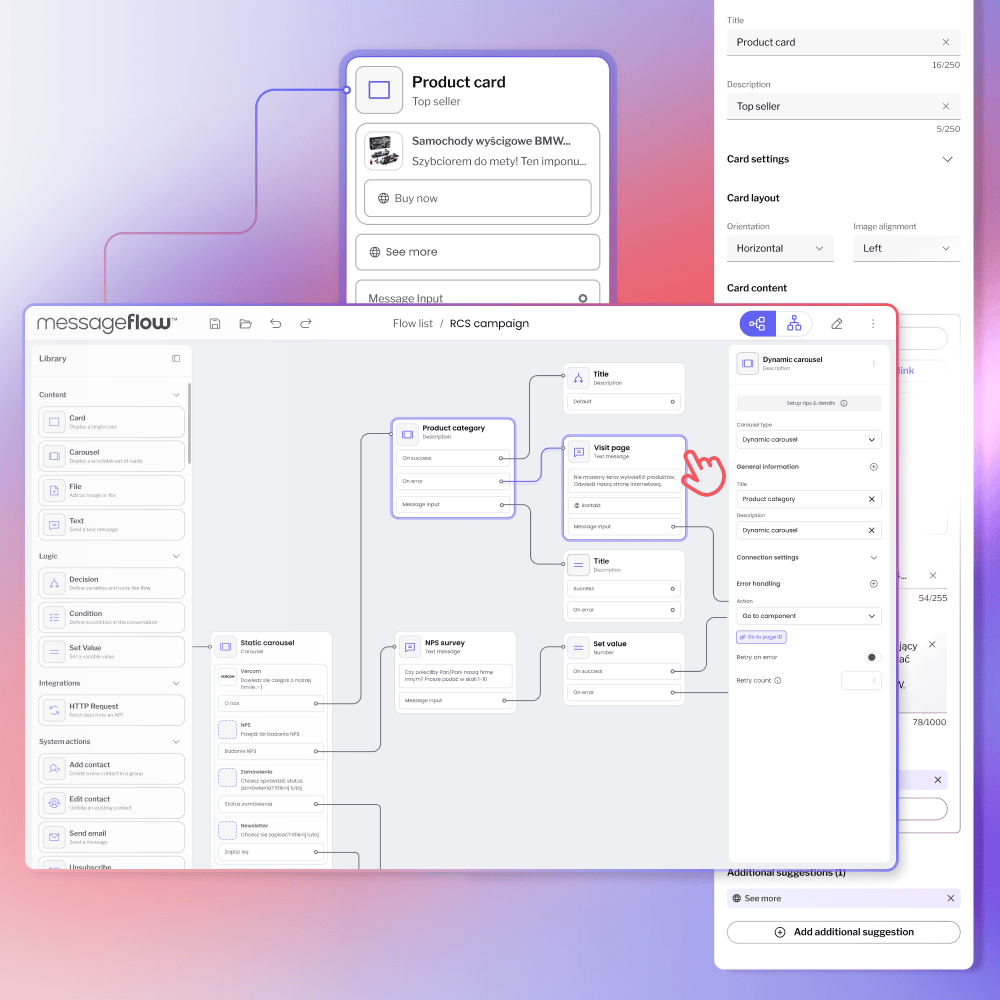
Case Study

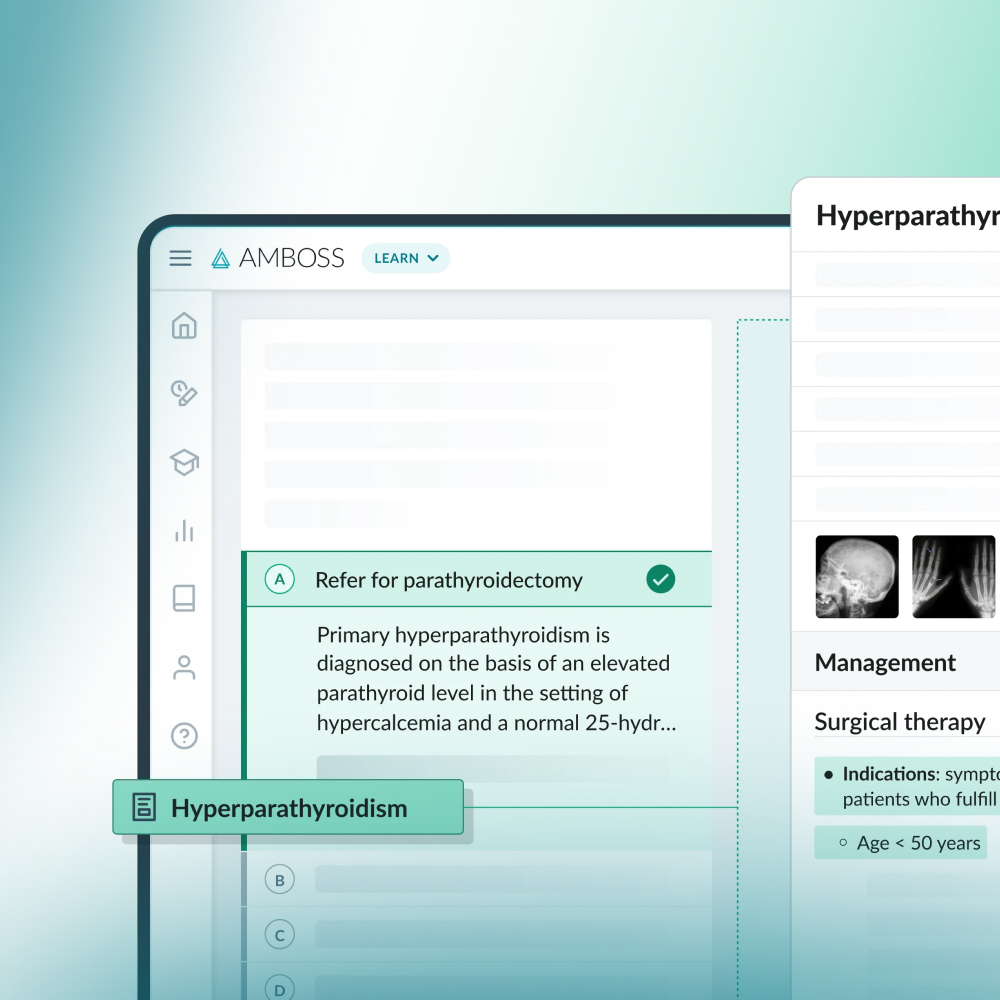
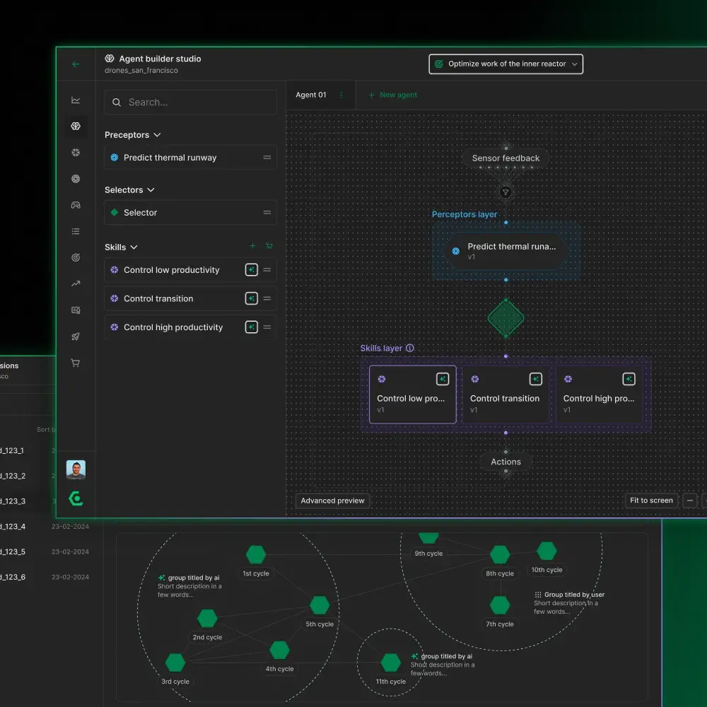
Interactive diagrams for a modern data platform to improve the user experience

With the help of a premium data visualization agency – a leading data discovery and governance solutions provider – it enhanced its data catalog, sped up time to market, and improved the user experience to win over its competitors.

Case Study

Chatbot’s redesign to improve user experience

Riversoft turned to us to redesign chatbot platform, improve its user interface and simplified the conversational flow creation to reinforce the app’s user experience.

Chatbot architecture design and development

Reinforce conversational platform design and empower it with machine learning algorithms for improving users experience.

Case Study

Schematic editor for OPAL-RT to build electrical circuits

Synergy Codes provided the client with a schematic editor that enables creating electrical circuits. It empowers advanced solutions for automotive, aerospace, power electronics, and power generation industries.

P&ID development service with a monitoring system

Create your refinery scheme, including flows, models, and logistics, using P&ID objects and links. Take advantage of premade set of reusable features and shorten your software’s time to market.

Case Study

A no-code, drag-and-drop solution for visualizing and mapping complex service flows

Explore a drag and drop flow builder to enable end users creating service flow mappings and step-by-step guides.

Modeling call flow diagram for better customer service

Look at how we simplified a call flow with a simple flow diagram that leads a user through a conversation step by step. Check out this solution for processes improvement in contact center.

Real-time collaboration experience for better communication

Look how we increased user experience by enabling real-time collaboration module for software development tool.

Industrial IoT dashboards to enable smart manufacturing

Get real-time data from your IoT sensors and add value to day‑to‑day operations with the industrial IoT Dashboards

Visualizing the IoT sensors data on hydroponic farm

A visual tool that allows the users to monitor and plan works in the area of a hydroponic farm.

Product configurator for automotive company

The intuitive product configurator for supporting the decision-making processes in the automotive industry.

Uplifting AV software with visual design and drawing app

Here is AV Design Software to build process flow diagrams fully remotely in real-time. It enables creating a good flow using drag and drop with connecting members, giving roles, and submitting the changes live.

Case Study

Graph database use cases

Want to maximize your project team’s performance? Learn from our success story and discover the benefits of a knowledge graph. See how our solutions can transform your resource allocation strategy.

Enterprise OKR dashboard for reaching the company’s goals

This transparent solution enables plan, control and execute your company’s OKRs effectively in the shortest possible time.

Process and data mining visualization

Interactive visual components that accelerate and simplify data analysis to use their maximum value for the business.

Digitised passenger flow for airport infrastructure

Flow simulation solution integrates data from IoT sensors, illustrates information, and interprets those in real-time to add value to day‑to‑day operations.

The healthcare data visualization tool to aggregate patient’s records

Healthcare Data Visualization Tool to combine visual data residing in different sources and providing users with a unified view of them.

Transforming paperwork into interactive assembly manuals

Automation and digitization of processes in a production company to induce faster and more effective operations while eliminating errors during the production process.

Cyber security architecture diagram with threats simulation

Introducing a cyber security architecture diagram that visually reflects the network’s security issues.

Turning complex processes into process flow diagram

Introducing process flow diagram and other visualizations that help enterprise-class company to build business processes and information flow with interactive dashboard

Empowering everyone to find, understand, and govern data

Discover Data Catalog Software with dependency diagrams, inheritance diagrams, and knowledge graphs, to list just a few.

Case Study

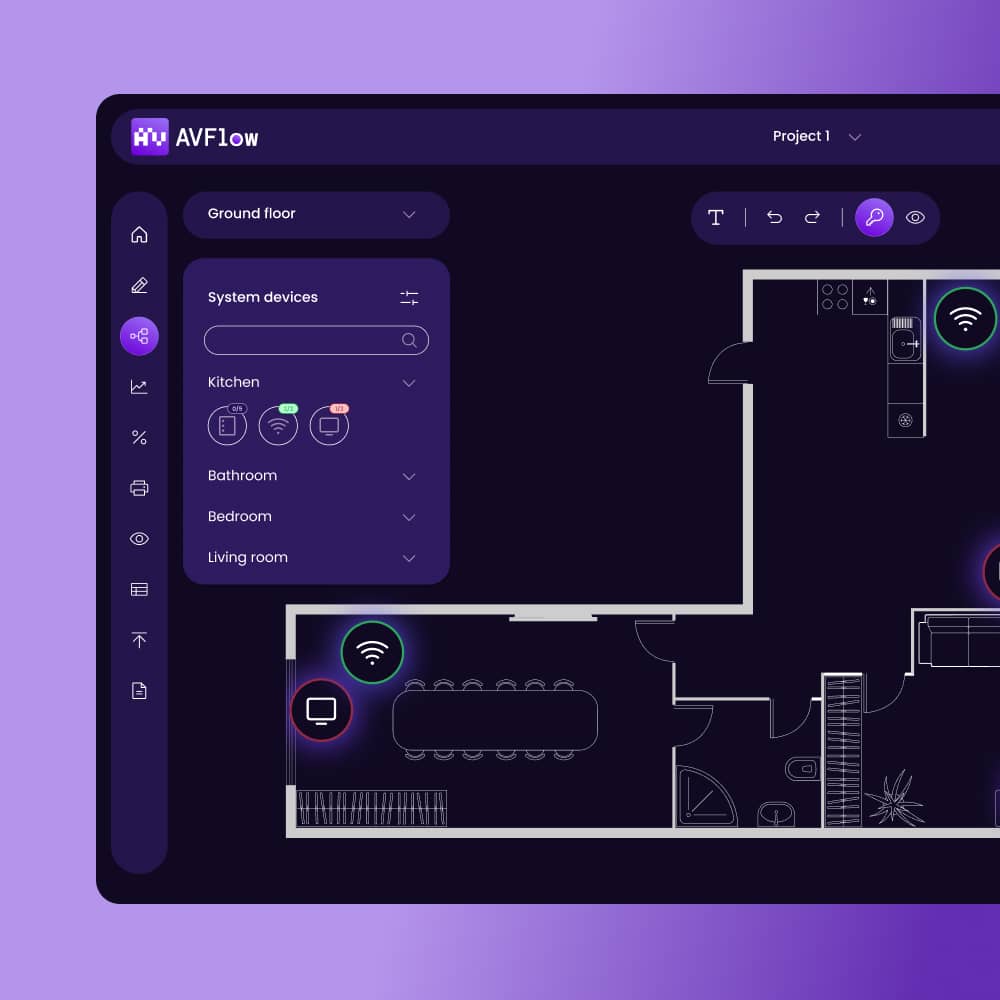
Smart building software for effective space management

We accompany the cutting-edge technologies and provide smart building software for space management. It enables live sensors monitoring and administration in the given spaces. The app’s functionalities are shared between managers, facilitators and building users to give a great management opportunities.

Making collaboration easier with process flow diagram tool

Build process flow diagrams fully remotely in real-time using drag & drop with connecting members, giving roles, and submitting the changes live.

Leave management dashboard for HR department purposes

Take a look at the custom leave management dashboard that enables requesting days off to the leader.

Core services for your data visualization

Creating a tool from scratch? Need to refine your existing tool? We’ve got you covered!

minimalistic illustration of a speech bubble with text lines inside, surrounded by radiating lines in purple, lime, and white, representing consultations for data visualization ideas
Consulting

→ Consult data viz specialists to elevate your app's functionality and user experience
 
→ Simplify complex data with expert advice, enabling your product's users to understand it easily

minimalistic illustration of a web browser window with an asterisk symbol inside, surrounded by radiating lines in purple, lime, and white, representing UI and UX services for data visualization
UX & UI design 

→ Build attractive graphs and no-code apps with our diagramming specialists
 
→ Enhance your UI to be intuitive and user-friendly with experts in navigation and diagramming design

minimalistic illustration of a code editor window with lines of code, surrounded by geometric lines in purple, lime, and white, representing product development for data visualization
Product development

→ Our extensive experience in data visualization will help you fast-track your product launch  
 
→ Get your MVP ready fast with our pre-built components  

Our front-end and collaborative technology partners

Benefit from our 12 years of experience in building data products and technological partnerships to get a data visualization solution tailored to your requirements

GoJS

Get better UX and performance, or redesign your tool, with the world’s only premium GoJS consultant

React Flow

Build node-based editors and diagrams with an exclusive React Flow technology partner

Yjs

Enable real-time, multi-user collaboration to enhance your app’s user interfaces and functionality with Yjs editing features

5-star reviews and recommendations

See what clients from various industries say about working with us 

Our cooperation with the Synergy Codes team proved they are a professional data visualization engineering company. They demonstrated exceptional technical skills, attention to detail, and a deep understanding of user experience. […]They kept us informed at every stage, promptly addressed our concerns or queries, and ensured a smooth collaboration from start to finish.

Portrait of Alex Kuo smiling and wearing glasses in a navy-blue suit jacket and a light blue shirt.
Alex Kuo
Chairman at RiverSoft

While looking for a proficient service in creating graphical components, we wanted to work with experts that would advance our tool with exceptional UX and UI, which enabled us to win new deals with significant clients.

Portrait of Aurelien Masse wearing a dark blue shirt and looking at the camera.
Aurelien Masse
VP Engineering at Zeenea

Management of resources and professionalism sets them apart from the rest. They are committed to being easy to work with and are adaptable. They take their business very seriously.

Portrait of Tom Lubinski wearing a light blue shirt and looking at the camera with a neutral expression.
Tom Lubinski
Former CEO at SL Corporation

Why choose us 

Fast project start, swift MVP development, full-stack expertise, and guaranteed confidentiality – unmatched by other agencies 

Illustration of two hands interacting with a touchscreen element, including purple and green accents on a black background, representing product full-stack product development for data visualization
Full-stack
product development

→ Get a fully functional data visualization product integrated with your technology
 
→ Our team of developers, designers, business analysts, QAs, PMs, and DevOps will support you throughout the product lifecycle

3x
faster MVP development
3x faster MVP development

→ Test the waters and get product feedback quicker with 3x faster MVP development thanks to our seasoned developers and premade data visualization components 

2 days
for project initiation
2 days for project initiation

→ Talk to top tech experts from day one

→ Within 2 business days, we will build a project team that will support you during the entire project

Flexible
hiring models

→ Tailor your payoff model to fit your budget, whether for single specialists or an entire product design team
 
→ Choose consultation or a long-term business relationship

A man in a gray t-shirt holding a tablet, standing in an office setting next to a person gesturing with their hands, representing flexible hiring models offer
No vendor lock-in
No vendor lockin

→ Team up with our developers to ensure knowledge transfers

→ Get comprehensive documentation, consultations, and training in GoJS, Angular, and React for independent future maintenance

100%
NDA secured enviroment
100% NDA secured enviroment

→ With Synergy Codes, your user data is protected by working with data using only its logical structure and strict adherence to non-disclosure agreements 

Our cooperation process in a nutshell

01

Introduction call

First, discuss essential information about your project or concept. Our tech expert and senior BA will offer you feedback and provide the critical steps on the spot.

Illustration featuring a hand pointing to a phone icon and another hand holding a data chart, connected by dotted lines. The design includes purple and green accents on a dark background, representing the first step in the cooperation process with our data visualization agency.
Illustration of two hands interacting with documents, featuring a central document highlighted in purple with text lines, connected to other documents. The design includes purple and green accents on a dark background, representing concept preparation for data visualization product.
02

Concept preparation

We invite you to a discovery workshop to create a comprehensive summary of your project requirements, ensuring that we develop what you expect. 

03

Cost estimation

We will estimate the development costs and time based on the project's scope of work. You can choose from a range of flexible hiring models to get the one that suits your needs.

Illustration of a hand interacting with one of three options displaying a list of items in purple and green. The design features additional screens on a dark background, representing optimal cost estimation for data visualization products.

FAQ

  • What forms of cooperation does Synergy Codes offer?

    We're flexible. If you prefer, we can put together an in-house team to handle most tasks and provide scheduled progress updates. Alternatively, we're happy to communicate more frequently if you'd like to be more involved. Outsourcing, where our specialists become part of your team, is also an option. Need quick fixes to existing code? We can do that. And if it's just a consultation you need, like advice on technology or product design, we've got you covered there too.

  • Do you have an off-the-shelf product or service?

    As an agency for business intelligence and analytics products, we don't have an off-the-shelf product. We offer comprehensive data visualization services that cover consulting, UX and UI design, and product development. On top of that, we use ready-made components for diagrams and data visualization for faster development.

  • What are the approximate costs? 

    Let’s meet first, and we'll give you a ballpark estimate based on your case or similar projects we’ve done in the past. This process is free of charge. 

  • How can you assist me if I only have a general idea or specific requirements/technical issues and need guidance on what to do next?

    We help clients with various requirements. Some have just general ideas, others need to solve specific technical issues. Our experience running diverse data visualization projects allows us to suggest general functionalities that suit your business. As part of our design services, you can participate in a dedicated workshop where we focus on your users' needs, analyze the collected information, and prepare project time and cost estimates.

  • What do you offer in terms of UX/UI design services?

    Our product design services will help you create engaging and user-friendly data visualizations for projects of all complexity levels. We bring your vision to life. Key services include the discovery and ideation phase, dedicated design workshops, UX audits, UI design, and design systems. 

  • Where can I see your completed projects?

    You can see our completed projects in the Portfolio section.

  • I am not a technical specialist. Do you work with customers without technical knowledge?

    Of course! We can do end-to-end project work with clients of all backgrounds, from simple concepts all the way to launch.

  • Do you offer your solutions via a subscription or service-based model?

    We offer our solutions through a service-based model.

  • Are you able to adapt to my technology requirements? 

    Yes, we have expertise in handling a broad range of back-end and front-end technologies. Here are the key technologies we integrate with:  
    - Data bases: PostgreSQL, SQLServer, MongoDB, Neo4J
    - Back end: .NET, NodeJS, NestJS, Python, REST Api, GraphQL
    - Front end: JavaScript, TypeScript, React.js, Next.js, Angular, GoJS, React Flow, Yjs

Portrait of Maciej Teska, CEO of Synergy Codes: a data visualization agency, wearing a blue suit jacket and a white shirt, smiling and looking directly at the camera

Many organizations need help with custom data features for their BI products and use third-party data presentation tools. They can avoid wasting time and resources by building a solution that meets their need for modern data visualization and attracts new users.

Maciej Teska
CEO at Synergy Codes
Not a fan of contact forms? Reach out to Maciej on Linkedin

Find out how we can help you upgrade your software and win more deals

Contact us to discuss your project. After you submit the form, we’ll get in touch with you within 48 hours to arrange a call.

Get in touch with us