Industry-specific diagrams: Specifications, use, and context

Explore how industry-specific diagrams like P&ID and dependency graphs optimize data visualization and process management in sectors like oil and automotive.
Industry-specific diagrams like P&IDs, flow charts, and data lineage maps are essential visual tools that transform complex operations into clear, actionable insights. From gas & oil facilities using P&IDs for safety simulations to automotive companies streamlining production with flow charts, these diagrams drive operational efficiency, enable predictive maintenance, and support data-driven decisions. By integrating AI and IoT technologies, modern diagram solutions evolve from static documentation into dynamic tools that deliver measurable ROI across manufacturing, energy, and data governance sectors.
Companies providing goods and services in automotive, manufacturing, and gas & oil industries rely primarily on data. Their proper presentation is supported by up-to-date diagram solutions that best illustrate and moderate information resources. Therefore, see examples of custom industry-specific diagrams that support error detection, process visualization, and decision-making, driving tangible business value through consulting-led design thinking and innovative AI-based technologies.
Custom diagrams for complex industry operations
Contact us.png)
What industry-specific diagrams are, and why should you know them?
An industry diagram is a specialized visual tool designed to represent specific aspects of systems within numerous industries.
These diagrams play a crucial role for professionals such as engineers, business analysts, and industry managers who rely on accurate data visualization. By providing clear, standardized visuals, they enhance communication among stakeholders, support compliance with regulatory requirements, and improve operational efficiency.
Understanding and utilizing industry diagrams enables organizations to visualize complex processes, detect errors early, and streamline workflows across sectors like:
Key benefits of industry-specific diagrams
- Visualize complex systems: They break down intricate processes into understandable components.
- Enhance error detection: By mapping processes clearly, diagrams help identify bottlenecks and flaws.
- Support decision-making: Visual tools enable faster, data-driven decisions.
- Facilitate communication: A common language for cross-functional teams and external partners.
Let’s investigate the commonly used diagrams in the mentioned sectors, focusing on aligning business objectives and supporting business process services.
P&ID for the Gas & Oil Industry
What is a P&ID?
A Piping and Instrumentation Diagram (P&ID) is a detailed schematic used in the gas and oil industry, but also in chemical processing, pharmaceuticals, power generation, water treatment, and many other industries. Engineers pay special attention to safe facilities operating in full compliance. A P&ID represents a physical process flow’s piping and related components. These diagrams help increase operational efficiency and support strong operational processes in the gas and oil industry.
Purpose and applications of P&ID
The industry-specific diagram - P&ID - plays the leading role in maintaining and modifying its graphically represented processes. For processing the facilities, it’s a graphic representation of:
- Critical piping and instrument details
- Control and shutdown schemes
- Safety and regulatory requirements
- Basic operational information
P&IDs in modern industrial operations
P&IDs (Piping and Instrumentation Diagrams) are essential engineering tools that showcase system interconnectivity and serve multiple critical functions in industrial operations. These diagrams enable engineers to evaluate construction processes, develop operational guidelines, and design conceptual layouts for chemical and manufacturing plants.
One of the key advantages of P&IDs is establishing a common technical vocabulary across teams. By providing a standardized visual language, they ensure all stakeholders remain aligned with plant operations and terminology, making documentation and communication significantly more efficient.
Interactive P&IDs have become particularly vital for conducting facility simulations. While their primary focus is visualizing system flows, complex operational scenarios require these simulations to support:
- Error-free maintenance at every stage
- Preventive and corrective process planning
- Inspection of planned activities for proper functioning
Beyond basic maintenance support, modern P&ID simulations integrate cutting-edge data analytics and AI-based digital solutions. This advanced approach enables continuous operation monitoring, analysis of system relationships and component interactions, and enhanced simulation accuracy through innovative AI technologies.
The result is a transformation of P&IDs from static diagrams into dynamic tools that optimize resource utilization, improve efficiency, and enable data-driven decision-making for intelligent business operations. Through this integrated approach, organizations can achieve both operational excellence and significant cost optimization.
Features of custom framework for P&ID simulations
Process safety consultants, particularly in the gas & oil industry, require specialized solutions that prevent hardware damage and minimize risks to employee health and safety. By combining extensive domain knowledge with technological expertise, they develop interactive diagram-based simulation management frameworks tailored to industry-specific challenges.
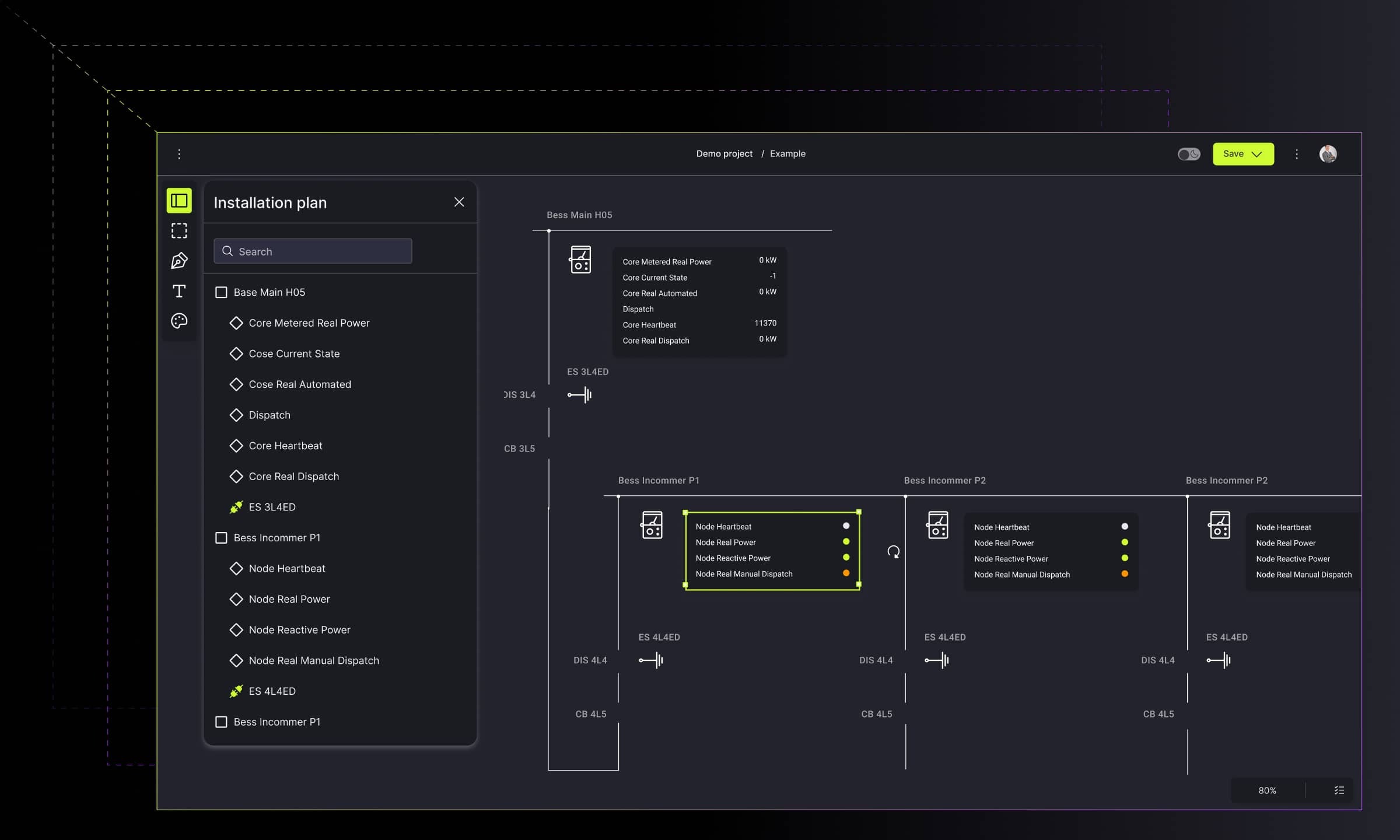
The following example showcases a Piping & Instrumentation Diagram tool built with GoJS, featuring components that enable diagram configuration and individual element property management.
Auto-completion mode
The auto-completion solution enhances the diagram creation process by providing intelligent suggestions for suitable objects and piping routes. Key capabilities include among others smart recommendations for object replacements within the network. The autocomplete function enables the snap to grid solution that ensures the readability of the diagram. In the case of exchanging objects in the network, the system itself recommends the available options. Thus, the whole process is bulletproof.

Mini-menu module
Performing simulations requires special attention to the details. With a large canvas, it’s hard to grasp the specific diagram or its elements. The available mini menu module addresses the challenge of working with large, complex diagrams. This feature delivers:
- Quick access to frequently used objects directly from the canvas using principles from building usable and accessible diagrams
- Visual feedback through color-coded functioning parts
- Greyed-out incompatible connections for instant verification
- Elimination of time-consuming palette searches

Warning detection module
The visual system allows checking out the network performance and detecting possible errors with:
- Three severity levels: concern, warning, and error
- Testing capabilities for failure scenarios (e.g., network disconnections during fires)
- Proactive failure prevention support
- Network optimization insights for future operations

Digital Twin module
Flows are an essential element of simulation. Digital Twin module brings simulations to life through dynamic visualization:
- Animated and static flow representations
- High-level system overviews with critical object highlighting
- Detailed views with node signaling through visual adornments
- Flexible perspective switching for comprehensive analysis

These integrated features transform traditional P&ID diagrams into powerful simulation tools, extending their application beyond gas and oil to automotive and manufacturing industries, where they support process automation and product lifecycle management.
Flow Charts for the Automotive Industry
What is a flow chart?
Flow charts, including Process Flow Diagrams (PFDs), visualize complex processes, systems, or algorithms. In automotive engineering, they serve as essential tools for documenting and optimizing workflows - from plant operations to detailed procedures.
The automotive industry's complexity - with interconnected supply chains, multiple production lines, and stringent quality requirements - demands sophisticated visual documentation tools. Flow charts help automotive companies streamline operations, improve cross-department communication, and accelerate error detection.
These tools integrate with PLM systems for precise product configuration. They also simplify workflows and ensure compliance. The example below shows how customized flow charts streamline operations. They improve cross-department communication and make error detection faster and easier.
The purpose of flow charts
What makes a flow chart truly effective? Above all, it's readability. Flow charts provide clear visual descriptions that help teams understand complex processes at a glance.
These diagrams serve multiple essential functions:
- Process planning - outlining essential steps and showing the bigger picture
- Task organization - arranging activities chronologically and categorizing them by type (process, decision, data)
- Action flow precision - defining the exact sequence of steps, required inputs, and expected outputs
Flow charts excel at revealing hidden inefficiencies. They help identify bottlenecks, flaws, and unnecessary steps that might otherwise go unnoticed. This visibility enables organizations to refine processes and better understand customer needs, driving innovation with tailored solutions.
Flow chart features made with a custom framework for a product configurator tool
A leading automotive company implemented a custom flow chart solution for their Product Builder web application, streamlining vehicle part construction across design teams. The system demonstrates how specialized flow charts can handle complex automotive requirements.
Decision flow diagrams
Guide engineers through thousands of nodes containing mounting elements and specifications

Action lists / administrator mode
Enable precise information exchange and quality assurance tracking
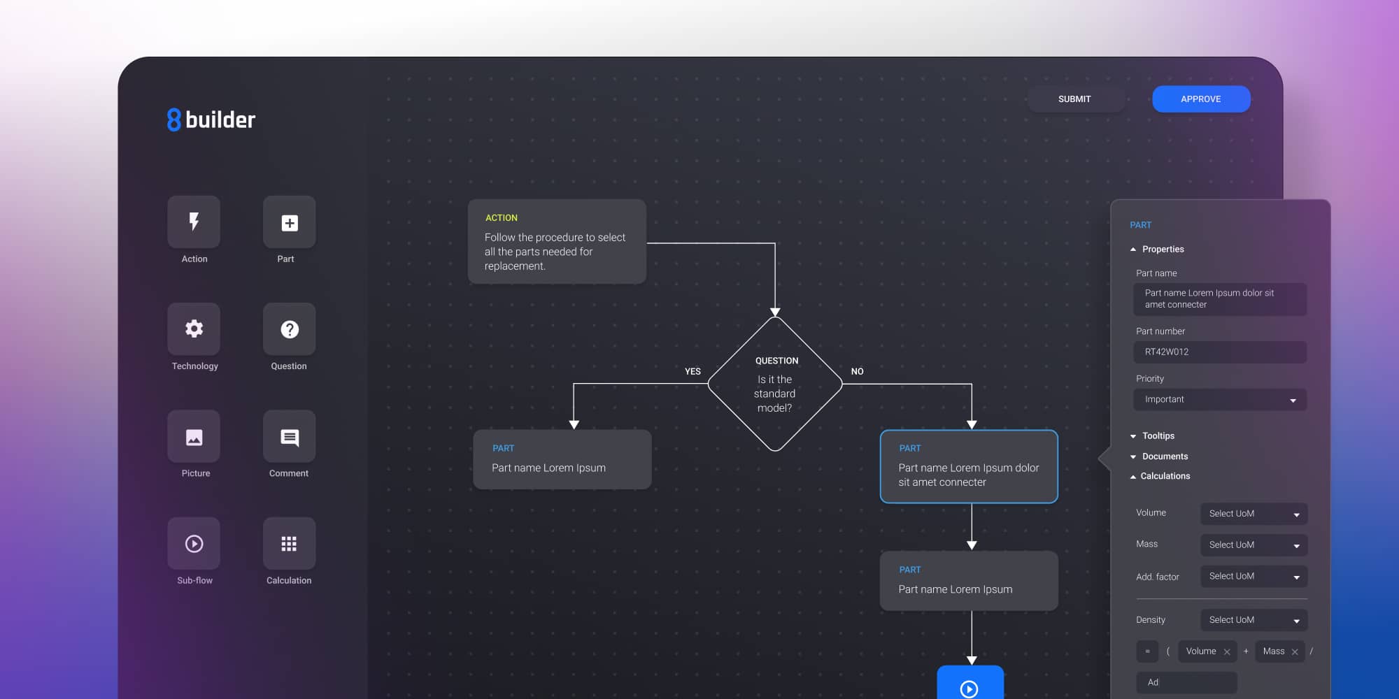
Bill of Materials (BoM) integration
Break down components and transfer business knowledge to engineering teams

Advanced features for enterprise-scale, smooth tool’s performance:
- Navigation & hierarchy
- Breadcrumb navigation for multi-layer diagram exploration
- Sub-flow division to manage repetitive tasks and import reusable elements
- Visual intelligence
- Dynamic color-coding of nodes and paths based on decision status
- Real-time visual feedback reflecting workflow conditions
- PLM integration
- Product development phase management aligned with PLM systems
- BoM tree structure defining part relationships and dependencies
- Automation & efficiency
- Node reuse across projects with automatic action propagation
- Template revision system for instant production updates
- Automated action annotations with cross-project synchronization
- Version control
- Alter/restore functionality for decision tracking
- Administrator-controlled template updates ensuring consistency
These features enable the tool to handle thousands of nodes while maintaining clarity, reducing errors through automation, and ensuring all teams work with current specifications.
Flow chart process automation tools in practice
Modern manufacturing companies enhance their flow charts with specialized digital modules that transform static diagrams into interactive automation tools. The following example demonstrates how industry-specific flow chart solutions support process digitization in production environments.
Automation and digitization of processes in a production company intend to induce faster and more effective operations while eliminating errors during the production process. Business processes services play a crucial role in supporting automation initiatives, helping organizations streamline workflows and leverage digital innovation for improved outcomes. As part of introducing such activities, both operators and production managers fully understand the progress and issue monitoring tasks.
The following features are based on industry-specific diagrams made for the production process allowing for quick and effective maintenance and adaptation of requirements to new products, further improving operational efficiency.
Manual flow builder module
An interactive dashboard equipped with custom functionalities to create and reuse the process supports proper flow management and task automation. It transfers selected actions to the production line employees, turning them into the process co-creators.

Check and plan module
The production planning and validation module allows the user to monitor the process’ progress. The admin observes the task’s progression, assigns roles and tasks, dives into subtasks and projects, and plans future work.

Process Flow Diagrams extend these benefits further in smart manufacturing and other sectors by integrating IoT data and enabling real-time monitoring.
Process Flow Diagrams in smart manufacturing
What is a Process Flow Diagram (PFD)?
A Process Flow Diagram (PFD) shows the relationships between components at an industrial plant. It is used to document, improve, and model processes for better understanding and control.
Such process flow diagrams not only improve quality in manufacturing but also find applications in the insurance sector, where similar visual tools support insurance services transform by optimizing processes, enhancing customer experience, and increasing operational efficiency. Extensive industry knowledge enables the development of effective process flow diagrams that address unique business challenges and drive innovation across sectors.
You can deepen your knowledge of that by reaching the article “Smart applications for factory management.”
The purpose of a PFDs
A Process Flow Diagram (PFD) shows the relationships between components at an industrial plant. With the PFD, you can document, improve or model a process.
The Process Flow Diagram has multiple purposes:
- To document a process for better understanding, quality control, and training of employees.
- To standardize a process for optimal efficiency and repeatability.
- To boost a process for efficiency and improvement.
- To model a better process or create a brand-new strategy.
- To enable communication and collaboration between users and other diagrams used in the organization.
Features made with a custom framework for intelligent manufacturing
Speaking of intelligent manufacturing, it’s common to use process flow diagrams, especially in modern organizations relying on tomorrow’s technology. Look at the features that enable intuitive process flow management, visual modeling of processes, and IoT integrations.
Customized plant builder
The main dashboard showcases the interactive palette of IoT sensors and nodes placed on the production line. Using the drag-and-drop option, the user places the objects on the line to check the production status in real-time. Sensors placed on machines collect data that are then used to create reports.
- Intuitive drag-and-drop interface for sensor placement
- Real-time production status monitoring
- Automated data collection for comprehensive reporting

Customizing widgets and dashboards
Users have complete control over the tool's appearance and functionality. The welcome panel enables configuration of location, sensor range, data types, and visualization preferences.
- Flexible dashboard customization for different data representations
- Configurable parameters including location and sensor specifications
- Cross-industry applications, from manufacturing to healthcare patient-centric strategies

Alerting and predictions in process management
The system leverages existing hardware and IoT sensors to deliver critical operational data. This proactive approach enables immediate issue resolution and prevents costly downtime.
- Real-time alerts for faults and performance anomalies
- Predictive analytics for optimizing asset usage
- Cost reduction benefits across industries, including financial services risk management

Real-time data monitoring
Back-end IoT solutions power comprehensive data monitoring capabilities. All collected information transforms into interactive diagrams that facilitate immediate decision-making.
- Interactive visualization of operational data
- Instant issue detection and alert notifications
- Enables quick preventive actions for industry processes efficiency

Data management diagrams for data lineage
As data-related demands increase within enterprises, the data landscape becomes more complex and distributed, pushing organizations to shift their data management practices from managing data to managing metadata. Workflows, or flow charts, for master data management, portray the specific activities or work steps required to perform the various processes related to data management.
There are multiple aspects important to maintaining data quality and structure within the organization. The data management diagrams’ role is to ensure data quality and data governance throughout the organization.
In public sector organizations, these diagrams are also essential for managing European funds, as they help streamline the allocation, monitoring, and reporting processes to ensure compliance and operational efficiency.
The purpose of data management diagrams
It might be tricky to visualize the flow of master data work activities or organizational data itself. The data management diagrams, such as flow charts, can help build the concept of master data work activities or processes.
Creating sound data governance procedures can give the organizations advantages over their competitors by monitoring those procedures through flow charts and periodic data review audits.
In the Data Governance companies, there are several ways to bulletproof the processes and ensure the correct data flow. These are:
- Standard training on data governance policies for employees
Creating formal enterprise-wide data governance training procedures, developed with flow charts, allows employees to maintain high-quality data throughout the data lifecycle.
- Identify root causes of recurring data record errors
Flow charts enable detecting the causes of repetitive and problematic errors within the organization’s database. With solid data management diagrams, you can track the data flow throughout the organization’s data warehouse to determine what part of the process is impacting data quality.
- Creating formal processes for data auditing and reporting
Improving data management processes must be reviewed periodically to assess whether data governance policies and controls are being followed.
Features of custom data lineage diagrams
For a leading Data Governance company, we provided a set of industry-specific diagrams supporting data management. Their purpose is to visualize the dependency between data collected in data catalogs.
Dependency diagram
The following diagram represents the visual presentation of data placed in various databases and data warehouses, reinforcing the importance of accurate data lineage. Categorized with AI into data sets and presented visually in swim lanes. Each node comes with a collapsible property section. The mechanism is equipped with a detection algorithm to ensure proper re-layout in any view.

Inheritance diagram
This diagram represents the data organization and relationships with various databases and data warehouses. Each parent node can lead to many other nodes and vice versa. The advanced layout is based on a custom diagram layout.
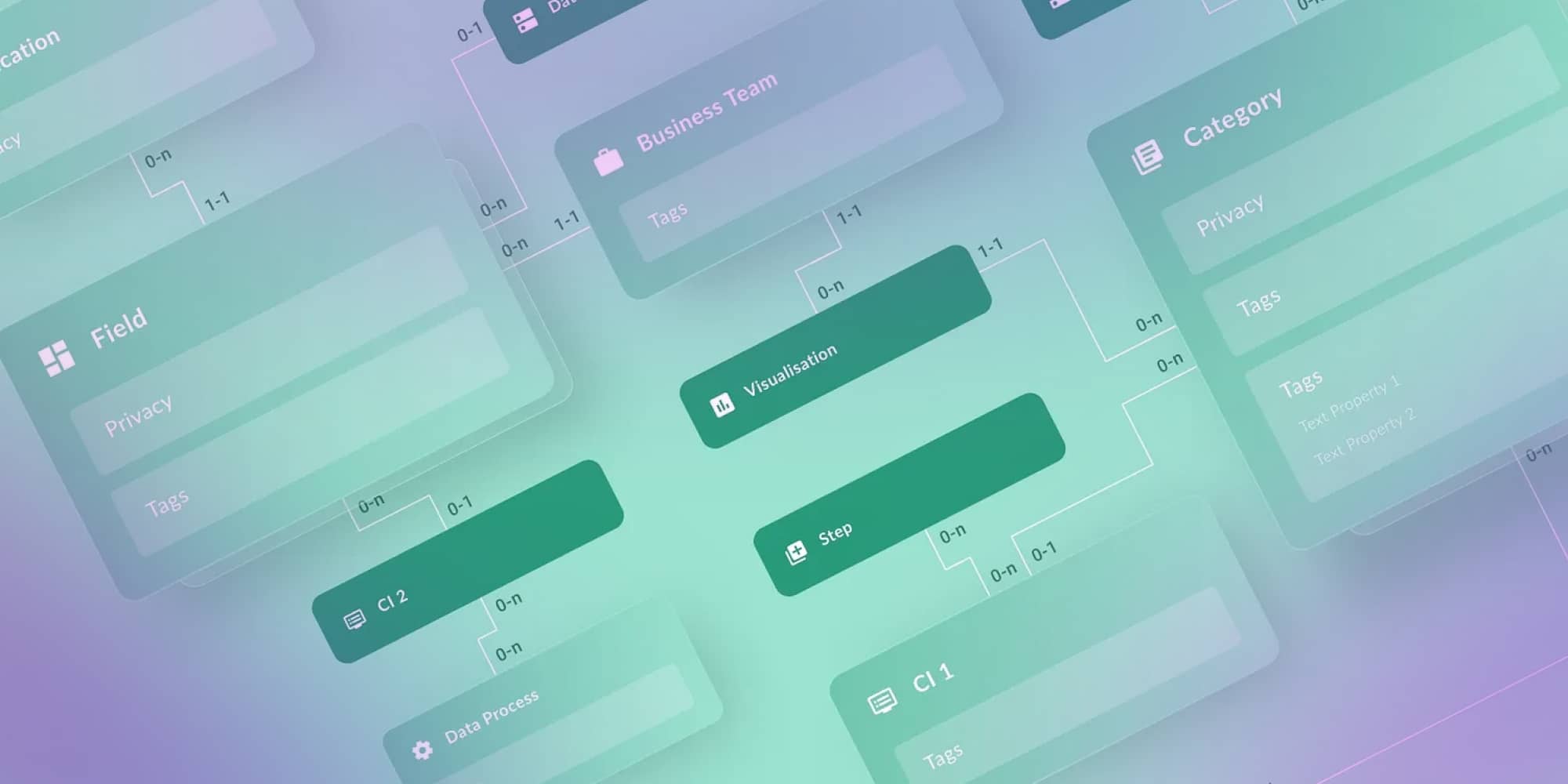
Knowledge graph
This view presents an indefinitely expanded diagram built with GraphQL API, similar to advanced graph visualization. Virtualization is activated with several thousand nodes, so there is no need to render everything visible on the screen. An applied minimap facilitates navigation.

Best practices for creating industry-specific diagrams
Success comes from combining domain expertise with technology solutions tailored to specific operational needs.
Different industries face distinct challenges that shape their diagramming requirements. Healthcare organizations must balance patient-focused strategies with strict regulatory compliance. Insurance companies need streamlined claims processing and robust risk management capabilities. Manufacturing and commercial sectors prioritize operational efficiency and cost reduction.
Modern diagram solutions gain significant value through data analytics and AI integration. These technologies enable:
- Real-time data-driven decision making
- Process quality optimization across all operations
- Scalable solutions that grow with business needs
- Measurable ROI through improved efficiency
The most successful implementations blend three key elements: deep industry knowledge that understands sector-specific pain points, digital solutions that leverage cutting-edge technology, and a strategic focus on transforming operational challenges into competitive advantages.
This holistic approach ensures diagrams don't just document processes – they actively drive business growth and innovation.
Challenges of industry-specific diagrams
Industry diagrams face three critical challenges in complex sectors like healthcare, finance, and supply chain management:
Compliance and accuracy - Diagrams must stay current with rapidly changing regulations while maintaining data integrity. This is especially critical in healthcare payer services and financial risk management.
Industry customization - Each sector requires deep domain knowledge to create truly useful diagrams. Generic solutions fail to capture industry-specific workflows and requirements.
User accessibility - Technical complexity often blocks adoption. Diagrams must remain intuitive enough for non-technical staff while sophisticated enough to handle complex processes.
The solution? Combine domain expertise with smart technology. Focus on customized, compliant solutions that adapt to changing business needs. When done right, these challenges become opportunities for competitive advantage and operational excellence.
Future of industry-specific diagrams
Your industry diagrams are evolving rapidly thanks to AI, blockchain, and IoT advances. These digital solutions help you improve process quality and reduce operational costs. You can now access sophisticated, industry-specific diagramming tools that deliver measurable results.
Process flow diagrams and piping instrumentation diagrams become smarter and more integrated. This means you can build customized, compliant business solutions that adapt to your changing needs.
Your industry demands drive better diagramming tools across telecom, manufacturing, and healthcare sectors. These solutions keep you competitive by leveraging real-time data and predictive analytics. You can optimize operations and achieve concrete outcomes that impact your bottom line.
Staying current with diagram creation trends and technologies ensures your visual tools deliver tangible business value. This approach supports your intelligent operations in a rapidly changing business environment.
Roll-up
Industry-specific, interactive diagrams are powerful tools that enhance communication, improve error detection, and support better decision-making across a wide range of sectors. From telecom services enhancing connectivity to healthcare provider services improving patient management, these visual tools deliver customized, compliant business process solutions that empower intelligent business operations.
For tailored solution for your organization contact Synergy Codes to explore cooperation opportunities.
- What are industry-specific diagrams and how do they differ from generic diagrams?
Industry-specific diagrams use standardized symbols and incorporate regulatory requirements unique to each sector. Unlike generic diagrams, they address operational challenges like safety instrumentation in P&IDs or PLM integration in automotive flow charts.
- Why are P&ID diagrams critical in gas and oil operations?
P&IDs ensure operational safety by documenting every pipe, valve, and instrument. They enable failure scenario simulations, efficient maintenance planning, and HAZOP compliance. Modern interactive P&IDs predict failures and optimize resource allocation.
- How do flow charts improve efficiency in automotive and manufacturing industries?
Flow charts visualize workflows and dependencies across production systems. By integrating with PLM systems and enabling real-time monitoring, they reduce assembly errors, improve communication, and accelerate product development.
- Can industry-specific diagrams support automation and digital transformation?
Yes. Modern diagram technology can transform manual engineering workflows into automated processes. For example, engineers can input structured data tables that automatically generate compliant P&ID diagrams – eliminating hours of manual clicking and dragging. This deterministic automation removes repetitive drafting tasks, reduces human errors, and enables teams to deliver projects faster.
- How do data management diagrams support data governance and lineage?
Data diagrams visualize flows across enterprise systems, helping maintain quality and enforce governance policies. They enable compliance demonstration and help teams quickly identify quality issues at their source.
- How can tools like Workflow Builder support industry-specific diagram solutions?
Workflow Builder enables teams to design, adapt, and automate complex workflows using visual models. Combined with industry-specific diagrams, it helps organizations digitize processes, improve collaboration, and align operational execution with business goals.
Delivery Lead and Principal Software Developer at Synergy Codes with 8+ years of experience in diagramming for complex industry-specific projects. Specializes in JavaScript/TypeScript, React, and GoJS to build data visualization solutions and interactive diagramming interfaces. Combines technical expertise with business focus to deliver practical, high-impact applications.

Find how we can help you enhance your software and win more deals
Contact us to discuss your project. After you submit the form, we’ll get in touch with you within 48 hours to arrange a call.