How to leverage charts and graphs in business
Learn how charts, graphs, and interactive diagrams simplify data, uncover trends, and improve decision-making, helping businesses leverage their data.

It's hard to imagine running a business in the 21st century without relying on multiple metrics and data sets. And the bigger the company, the more data it collects and processes. But since everything that happens in a business generates so much data, a lot of it gets overlooked, and its potential is lost because it's difficult to process and act on all of it. This is where charts, graphs, and diagrams come to the rescue.
The power of a well-designed chart lies in the business value it unlocks: providing actionable and accessible insight, facilitating business intelligence, providing convincing arguments in presentations and marketing, or simplifying management of multiple, complex processes. If you've ever wondered how to improve your business results and organizational efficiency by leveraging all the raw statistics, metrics, and information already floating across your company, this article is for you.
The Difference Between Charts and Graphs
Let's start with the basics: the words "charts" and "graphs" and "diagrams" might often be used synonymously, but they refer to different things.

Charts are visual representations of information. They are the most general category that includes graphs and diagrams.

Graphs are charts representing numerical or statistical variables and functions on the x-axis and y-axis. The x-axis represents a known dimension (such as time, e.g., month), and the y-axis refers to the measured or counted metric (e.g., the number of products sold in a given month). A line graph is usually the best choice for continuous values (such as time). But if the data is represented across discrete categories (e.g., product categories or customer segments), a bar graph is usually best.

Diagrams are another type of chart that can represent statistical information and visualize systems, conceptual models, structures, and processes, with multiple elements and complex relationships between them.
Which Type of Chart Should You Use?
When precision and mathematical analysis are needed, such as when comparing specific metrics and their dynamic over time or other numerical dimensions - line graphs are the go-to choice for scientists, business analysts, accountants, and administrative managers. When it comes to presenting insights, making infographics, explaining systems or processes, and managing projects and organizations - charts offer dozens of types, styles, and capabilities to make the information useful and impactful.
A few basic guidelines for choosing the right type of chart could be:
- Use a line graph to show how a metric changes over time, allowing for an easy view of trends and patterns.
- Use a pie chart to break down a metric into its components - e.g., what expenses make up a project budget.
- Use a scatter plot to show complex relationships between numbers and detect possible correlations - e.g., the average purchase value depending on the time of the day.
- Use diagrams to explain and manage processes and systems - e.g., a Gantt chart for project timelines or a flowchart to show a decision process.
But these are just a few of the most popular types. Read this article to find out which type of chart could empower you to make the most out of your data. Keep reading this one to learn about leveraging data visualization for business impact.
Why Does a Modern Business Need Graphs and Charts?
Every business decision needs to be based on facts, and in modern business, we measure facts by collecting and analyzing data, usually through Business Intelligence (BI) tools.
Graphs and Charts in Data-Driven Business Management
As much as we, as a society, have become used to statistics and metrics, the human brain finds it very difficult to understand something until it is visualized. We can compute it, but not fully comprehend it.
Using the relevant charts for business analytics, most specialists can access valuable and actionable information to spot patterns and reach their objectives more effectively:
- Sales or marketing teams can track the effectiveness of their campaigns and optimize future activities based on trends they spotted in charts for campaign performance.
- Business units can plan product manufacturing volumes or investigate new product development needs by analyzing sales metrics displayed over time and market segments.
- Finance departments rely on a whole set of graphs and charts to analyze and optimize expenses and financial flows, from wages and investments to physical metrics such as heating costs and water usage measured at the office.
Interactive Graphs and Charts For Security and Technical Operations
The business usefulness of graphs doesn't stop at financial metrics and generating profits. Visual data monitoring tools can also prevent massive losses, thanks to use cases such as:
- Real-time monitoring with data visualization accessible to all employees. It can prevent potential losses due to incidents and bottlenecks.
- Facility management. From data centers to manufacturing plants - facility managers can monitor temperature, humidity, and other parameters of machines to look out for malfunctions displayed in production line sensor dashboards.
- IT infrastructure monitoring. System admins can monitor traffic, manage workload in real-time, or plan maintenance thanks to historical charts.
- Network security. Cybersecurity specialists use traffic graphs and activity charts to manage computing load and monitor for potential threats.
Interactive Diagrams and Charts in Management - Case Studies
Metrics and graphs are fundamental to monitoring and optimizing business results by visualizing what is happening in the market and inside the company. But diagrams and other non-numerical charts can provide insight into why, how, and where something is happening and who is doing it. And with that insight, these visualization tools can be leveraged to inform managers and make decisions that lower costs and boost business value - through better management and process visibility or by designing new processes.
Here are some of the ways how Synergy Codes Clients used data visualization and interactive diagrams to improve their operations.
Visually Aggregated Data - Patient Record Management Platform for a Healthcare Company

In close collaboration with a Client in the Healthcare industry, we have built a robust platform for analyzing and managing patient records and hospital data in one dashboard, combining multiple data sources. The customizable dashboards display insights - both real-time and aggregated over time - into the exact information that a given user needs. For example, administrative employees can see a patient's personal information and visit history, doctors can view that and treatment history, and clinic administrators can see the insight that will help them plan staffing, insurance contracts, and utility costs.
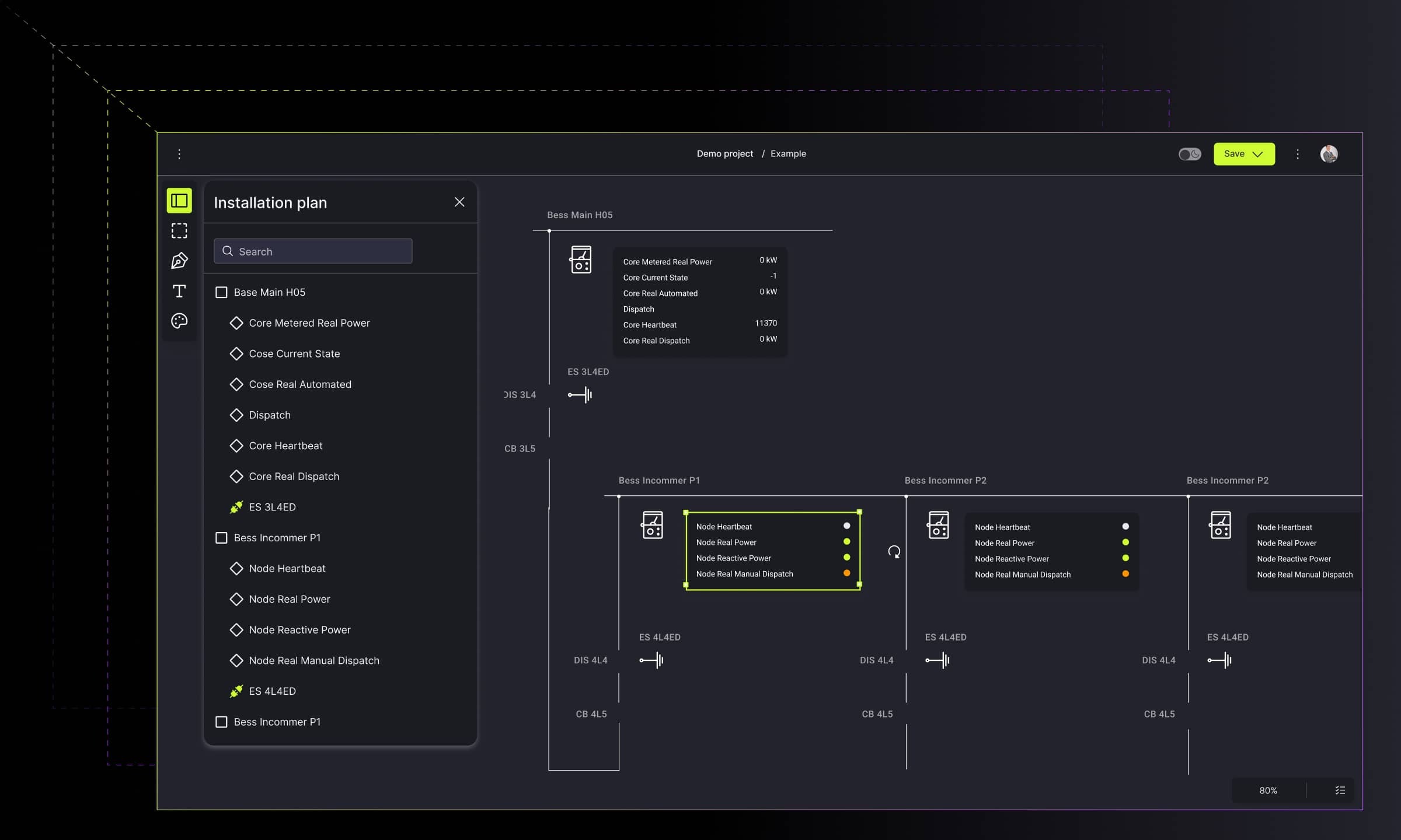
Data and Process Flow Diagram for Enterprise Software and Services Provider

Every enterprise company today faces the challenges of scale, such as complexity of structure, multiple interactions between processes and departments, and the struggle to keep the information flow efficient. Together with a client from the software development industry, we have built a platform that utilizes business process and information flow diagrams for interactive visualization of complex company processes.
The platform included an expandable and scalable data and process flow diagram, where multi-level nesting nodes enabled helicopter view and close-up views of processes and their dependencies. Additionally, the Gantt Chart feature gave project managers and team members clear insight into project timelines and team members' responsibilities for each stage of the process. All of this led to improved cooperation, communication structure, and transparency and empowered people to use the simplified insight to optimize processes across different departments.
Visual OKR Management in an Enterprise Company

The biggest challenge of an effective strategy is execution. With powerful but complex approaches like OKR (Objectives and Key Results), the ability to visually map and manage dependencies and connections between stakeholders can make or break the organization's chances to go from functional to exceptional cooperation and remarkable results.
With that in mind, we have developed an enterprise-grade Results Orchestration System for OKR management that facilitates the planning of organization goals, visualizing processes, and monitoring the status of planned achievements.
These are just a few examples of solutions we have built. Make sure to check our portfolio to explore more possibilities.
How to Get The Most Out of Business Data - Interactive Data Visualization
The power of business intelligence comes from harnessing the complexity of multiple data sources and finding relationships between diverse metrics. This is where interactive data visualization empowers managers and employees to get maximum value from the collected information.
Interactive visualizations are produced by tools that allow for direct modification of charts and graphs on a graphical plot. This includes filtering, grouping, creating hierarchies, zooming in and out, and combining different data sets to explore patterns and extract insights.
Benefits of Interactive Data Visualization
Being able to manipulate how business data is displayed allows the interactive visualization tool users to identify trends faster and see relationships and patterns more clearly, in a way that otherwise would require advanced data analytics skills.
The right interactive visualization tools make it easy to simplify complex data through filtering, organizing, and limiting or extending the scope of metrics. This readable information can then easily be turned into insights in the form of customized dashboards, reports, infographics, and presentations, providing powerful input for data storytelling.
How to Get Started with Interactive Data Visualization
Interactive Data Visualization tools can either be purchased as Out-of-the-box (OOTB) products or custom-built. Before choosing or developing the right tool, it is crucial to start by preparing the data ecosystem and determining the expectations and needs that the data visualization platform needs to meet.
The basic steps of such preparations would be:
- Ensuring that the company IT ecosystem has sufficient and properly organized data for visualization.
- Investigating expectations for the data visualizations: who needs them and for what purpose?
- Comparing currently used data intelligence solutions and determining what is missing - are they failing to provide valuable and actionable insight? Are they accessible to every employee that could benefit from better information for their tasks?
Although this decision may involve engaging multiple stakeholders in the company and a bit of planning, it can bring significant business value in many business domains - from maintenance to project management and sales.
Summary
There is no limit to how visual data representation can be used to generate insight and improve business outcomes. Our works represent a fragment of the versatility of this domain that we tapped into with our clients, and we are eager to explore more of it. If you want to explore what value your business can get from charts, graphs and diagrams - let's get in touch!
A team of authors and subject matter experts (SMEs), including former employees, who played an active role in content creation.

Find how we can help you enhance your software and win more deals
Contact us to discuss your project. After you submit the form, we’ll get in touch with you within 48 hours to arrange a call.